- Client
- Distell
- Agency
- Publicis
- Brand
- Three Ships Whiskey
- Duration
- 3 weeks
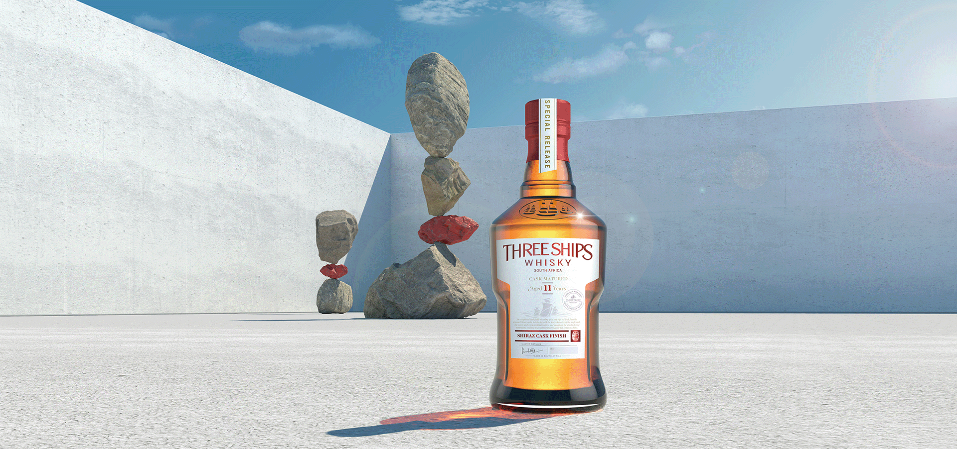
The brief was a campaign key visual for a limited-edition Three Ships Whiskey bottle. The idea to land was balance: the whisky is sold on a perfectly balanced flavour, so the image had to feel balanced before anyone read a word.
We built an abstract set rather than a real location: pale concrete planes, open sky, and rocks stacked in arrangements that look like they should not stand. Nothing in the scene competes with the bottle. The rocks carry the message and the light leads the eye back to the label.
Rock is easy to get wrong in CGI. We used Megascans, scanned real-world surfaces, for the stone, so the stacks read as heavy and physical rather than modelled. The bottle was built to match the limited-edition pack, glass and label detail included.

Three weeks from brief to final render, and the finished visual became the hero image of the limited-edition campaign.
This is what we now call a Product Shoot: one accurate product build, one campaign-grade image, and an environment designed around the idea instead of found on location.


